App Design II -Task 1
29/08/2023-19/09/2023 (Week 1 -Week 4 )
Brigita Maria/0352958
App Design II / Bachelor of Design in Creative Media
3D render by Martin Martz
App Design 1 Self-Evaluation and Reflection
This self- reflection's purpose is to understand what have I worked on, what did I do right and what did I do wrong from the previous re-design of Kumpool App. And from this self-reflection, I expect to develop a more nicer design and experience for the user! Initially, I feel like I don't feel like I need a lot of things to change. I do realise my re-design is not 100% done and finish. It does not feel like a "FINAL" prototype, what a "REAL" app feels like.
So I decided to refine my ideas and find better ways to make the experience nicer while the user are browsing and scrolling through the app!
Week 1:
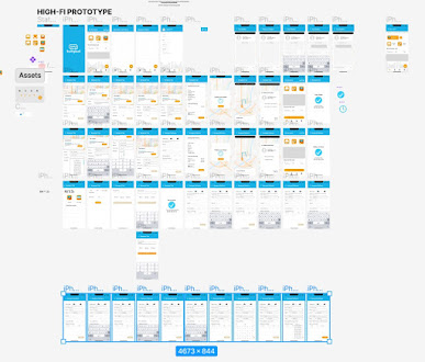
Figure 1.1 Overview of the app protoype
At first I was wondering what should I change with the app? But after
feedbacks from Mr.Razif and also internet surfing. I decided to change alot
of things. One aspect that I did not change is the
color, because
Blue and orange (mainly blue) has been Kumpool's app color.. Although their
logo isss like this:
Figure 1.2 Kumpool logo
Purple, yellow, blue and pink.. But the app
has mainly blue, white and little bit of oranges. I did not go far from the
original colors, and I think it isa good color combo.
Their app interface (used to be) is like this:
Figure 1.3 Kumpool original interface screenshots
But recently I checked the app again and they actually have improved! Some
features and interfaces are more better I would say.
Figure 1.4 Kumpool's interface now (1)
Figure 1.5 Kumpool's interface now (2)
But they still use the "Looks like a chatbot" interface, and I feel like
it is quite unfamiliar for any e-hailing app, even though they are not the
typical e-hailing app. And for me it is not intuitive for some users base on my research and survey.
Figure 1.6 Main menu section (Before)
This is the main menu that I have made on the previous module, I need to add
more content inside to make it as if its a real app. Inserting some pictures
for the advertisement section. Insert some things inside the boxes in the
trip history and inbox. Maybe fixing the font size, to make it
bigger (?)
Figure 1.7 Main menu section (After)
I also decided to make a log in and sign in page, as the original and my
re-design does not have it. I think it would be essential to have that page.
Figure 1.8 Login and Sign-in page
I give the option to have these login or sign in page is to make payment and
top-up e-wallet easier, because in the original app they need to sign-in in
order to do that (but weirdly it didn't ask the user to sign in or login).
Honestly, I still feel it is lacking in the design, but somehow have not
figure it out >:(
I also added a section for profile details, that in the previous submission I don't have.
Figure 1.9 Profile Details
Week 2:
Continue to fix the app :(
I continued from last weeks revision with adding the pages for Login.
Figure 2.1 Login page
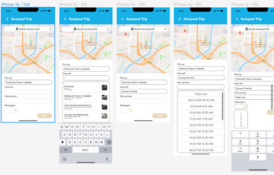
Figure 2.2-3 Booking page (Before & after)
To dissect it more, I decided to remove the "Quick Booking" after the user
started to fill in the information in the booking page. It only makes
sense, anndd I also wanted the user to focus on the map and by deleting
the "Quick Booking" it would create more space for the map to show up.
Figure 2.3.5 Button color
I changed the button interface, if the user still needs to fill up information, the next button will be "inactive" meaning the user can't select. Intuitively and from a dozens of other websites and apps, the color will be muted. hile if the user already filled up all the information needed they button will change color into the vibrant one, indicating it can be clicked or pressed.
Figure 2.4 Booking page with "Quick Booking" removed
Also to edit the booking page interface and also the experience.. To
be specific, I changed the search bar to service zone options and also the
drop down design of options.
Figure 2.5-6 Search bar and search service zone (Left to right)
I also added the drop down for the Service Zone where options will be
available. I decided to make it as overlay to make it easier for me hehe
>:)


Figure 2.7-8 Dropdown options of service zone as an overlay
For the pick up and drop-off drop down I added pictures so the user can
visualize the place.
Figure 2.9 Small picture on the right side of the options
Figure 2.10-11 Not completed booking and completed booking (left to right)
I changed the colors of the "Next button" when the information of booking is
completed. This is just some small adjustments to make the experience of
user more better.
Week 3&4:
To be honest the following week I did not edit too much. I only review the app
if there is anything missing or needed to be add.
Figure 2.12 Added some small minor things on the icons
Figure 2.13 Fix again the color of the login page (Before & After)
Figure 2.14 Change the color of the pop-up current trip
Figure 2.15 Change the color of the quick book
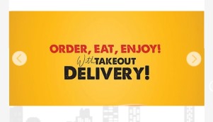
Figure 2.16 Change the format of the advertisement
After these iteration I feel like the app became more refined and have a better user experience overall. I manage to fix some of the feedbacks from Mr.Razif and added some myself to the parts that I don't feel good enough.
Class Exercise:
Exercise 1
Exercise 2
Week 1:
Mr. Razif reviewed my app. He said if he
was the lecturer of the previous module (App Design I) he would give
this B-. Need to make it real as if you are using the real app. So give
samples and content inside. Fix the size of the text. Figure out the
drop down situation. He liked the original one. If does not matter if
the option were carried to another page (he said).
Week 2:
-No
Week 3:
-No
Week 4:
-No
From this task 1, I dug back all the thing I had done and what improvements
I did to the previous app. Although I changed the interface and the
experience of the app (alot :)) but it still lacks the the real feeling of
the app. How it can actually resembles a real working app. I feel like that
aspect I still lack on.
Hopefully after this task 1, I am able to create a better looking app and
can discover and analyze more tings that can be revised in any current apps
that I am using. Learn to be a better observer and analyzer. I guess...
Anyways, this task made me learn that no matter how perfect you have done
your work (that you think its perfect) there are still room to improve it
more and more.


.png)

.jpg)


