Art Direction - Final Project

INSTRUCTION
Compiled data and assets: https://drive.google.com/drive/folders/1--mvmIhs6hQ5RHT3tNtK2Q1yMPVhTDTh?usp=drive_link
Illustration of UI
The finalization process of the screen design for the game visuals involved several steps to ensure that the visual elements were both engaging and functional, while also creating an immersive barn and farm aesthetic.
These are the UI assets to support the "Farm Life" look.
 Figure 1. Buttons for directory (1)
 Figure 2. Signage Illustration (1)
 Figure 3. Signage Illustration (2)
 Figure 4.
.JPG) Figure 5. Illustration for Local and Online (ver.1)
Figure 5. Illustration for Local and Online (ver.1)
 Figure 6. Illustration for Local and Online (ver.2)
 Figure 7. Buttons for directory (2)
 Figure 8. Platter
.PNG) Figure 9. Cooked chicken on a platter
Figure 9. Cooked chicken on a platter
 Figure 10. Chicken pressing red button
 Figure 11. Impostor getting kicked out
 Figure 12. Chicken crewmate getting kicked out
 Figure 13. Illustrative CTA Button
Illustration of UI


.JPG)


.PNG)


Illustration of Map and Background
 Figure 14. Colored Map
 Figure 15. Colored Map refined
 Figure 16. Close up labor room
 Figure 17. Close up bedroom / chicken coop
 Figure 18. Close up dining room
 Figure 19. Task in dining room
 Figure 20. Task in labor room
 Figure 21. Task in bedroom/chicken coop
 Figure 22. Impostor kicked
 Figure 23. Chicken/crewmate kicked


Screen Design and Layout
 Figure 24. Initial landing screen design

.png) Figure 25. Landing screen design
Figure 25. Landing screen design
Next, we explored options for the public room selection screen. We experimented with different layouts and styles (Figure 26 and Figure 27) to find the most effective way to present this feature. First one is the one without illustration and the second one is with illustration.
.png) Figure 26. Public room option (ver.1)
Figure 26. Public room option (ver.1)
 Figure 27. Public room option (ver.2)
 Figure 28. Find game screen
 Figure 29. Create game screen
.png)
.png)


.png) Figure 30. Chat design voted
Figure 30. Chat design voted
-1.png) Figure 31. Chat design
Figure 31. Chat design
 Figure 32. Chat design (chat sequence)
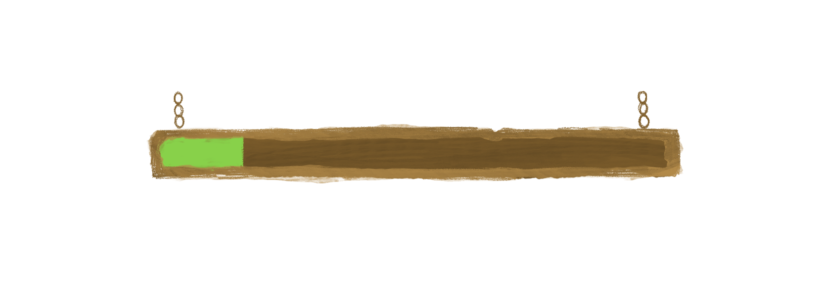
Adding UI assets was another critical step. We incorporated various buttons for navigation (Figure 1 and Figure 7), signage illustrations (Figure 2 and Figure 3), and illustrative CTA buttons (Figure 13) to enhance the user interface. We gave these assets a wooden look to complement the game's barn and farm theme. This choice ensured that the UI elements seamlessly blended with the overall art direction, reinforcing the rustic and cozy atmosphere we aimed to create. The wooden design of the buttons, signage, and other UI elements provided a consistent visual language that enhanced the immersive experience.
 Figure 33. Playing screen in bedroom (1)
 Figure 34. Playing screen in bedroom (2)
 Figure 35. Playing screen in dining room
 Figure 36. Playing screen in labor room
 Figure 37. Playing screen in living room
These screens required a careful balance between aesthetic appeal and practicality. During this process, we realized that the ratio between the character and some of the room elements seemed off (as seen in Figure 36). This realization highlighted the importance of considering and calculating the ratios of all details and elements in each area from the start to ensure visual harmony.
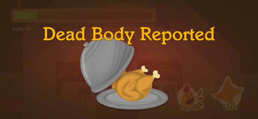
 Figure 38. Dead body reported screen
 Figure 39. "Kill" or "cook" screen (1)
 Figure 40. "Kill" or "cook" screen (2)
 Figure 41. Emergency meeting screen
Finally, we designed specific game screens for critical moments, such as the dead body reported screen (Figure 38), the "kill" or "cook" screens (Figure 39 and Figure 40), and the emergency meeting screen (Figure 41). These screens were crucial for maintaining the game's narrative flow and ensuring players were always clear on what was happening.
.png)
-1.png)


Challenges
Designing for our project was a journey filled with excitement and hurdles. One of the toughest challenges was merging creativity with functionality. We wanted our visuals to be engaging but also easy to navigate, and this balance required constant testing and tweaking, which sometimes felt overwhelming.
Another major challenge was finding a unified art direction. Each team member had unique ideas and visions, and bringing these together into one cohesive design was no small feat. It took endless discussions, brainstorming sessions, and compromises to ensure everyone felt heard and included.
We also struggled to improve the art direction continuously. Experimenting with different styles and themes to find the perfect match for our game was a process of trial and error, demanding both patience and perseverance.
FEEDBACK
Our experience gave us a better knowledge of art direction. It's about developing a visual style that complements the project's narrative and aims while maintaining aesthetic appeal and usefulness. We learned the value of conducting research, creating a solid concept, and ensuring consistency across all visual aspects.
Collaboration and communication were essential. Working directly with team members helped us align our vision, overcome disagreements, and make sound decisions. We learned to carefully listen and combine several thoughts into a single, clear picture.
Above all, understanding our players was crucial. Thinking from their perspective and designing with their preferences in mind made our choices more informed and meaningful. We considered their demographics, preferences, and the overall gameplay experience to create an immersive and engaging design.
In conclusion, the challenges we faced were invaluable learning experiences. Playing Among Us provided insights into the importance of simplicity, color theory, character design, and user experience. Our journey taught us the significance of collaboration, communication, and understanding our players. It was a heartfelt and enlightening process that shaped our project into something we are truly proud of.