Week 1: Elements of Design, Principles of Design, and Progress
04/01/2022-06/01/2022 (Week 1)
Brigita Maria/0352958
Design Principle/ Bachelor of Design in Creative Media
Introduction & Exercise 1

Jumplinks 🐉
1.1 Elements of Design
Elements are building blocks to a design. There are dot, lines, shape, color, space, and texture.
Dot
A point or dot is the simplest
element of design. It can create the other elements. A dot used as repetitive mark
forms a line. As the point moves in space, other
two- and three-dimensional figures
and forms are created.
Lines
A line is any two connected points. These lines can be straight or curved, and may be smooth, continuous, broken, thick, or thin.

Figure 1.1.1 Types of lines
A line can create division and hierarchy in your design, and help direct the user's eye toward specific focal point.
Shape
Shape, is a 2D line encloses an area. A shape can be geometrical (circle, square, or triangle:, or it can be organic shape (leaves, flowers, etc). Boundaries (color or lines) define shapes and also help emphasize the page area.

Figure 1.1.2 Shapes
Color
Color is also another element of design. We can highlight elements using color, it can be a background and stand alone.
Color is a tool to create mood of a certain design or visual. For example red can represent as love, power, desire; while white can symbolize pure, clean, simplicity.
There are some properties that we need to know to guide us mastering this principle, these properties are:
- Hue is the color itself. Red, blue, green are examples of hue.
- Saturation is the intensity of the color.
- Value is the lightness or darkness of a color.

Figure 1.1.3 Color wheel
Texture
Texture is the way an object (surface) feels or how it could feel. It creates dynamic and visually appealing, also adding depth to the design.

Figure 1.1.4 Paper texture
Space
Space is the areas surrounding an object. It can be a positive space or negative space. Positive space is the subject or area interest. On the other hand, negative or white space, is the background area that surrounds the subject or areas of interest.

Figure 1.1.5 Negative space creates a shape
Type/ Typography
Type is a text that conveys message and also the mood and set the tone of the design. Also it creates visual hierarchy, it shows where to look at and what is the most important thing in the design. For example the sizes of the font, it will catch the readers eyes and is the focal point of the design, and the smaller font is the subsection or the support of the bigger text.

Figure 1.1.6 Different type of fonts
1.2 Principle of Design
Principle of design is the way we arrange the elements. The principle of design are emphasis, balance, contrast, repetition, harmony, movement, and unity.
Emphasis
Emphasis' goal is to create a focal point/center of interest of the design. Creating something for the viewer to look and pay attention to. Naturally, the eye will skips to the subject that we emphasize. Usually designers use contrast of values, and or color, the placement, variation, size, etc.
Balance
Balance is where there is a distribution of interest or visual weight in a design. A balanced design will have the elements arranged that it will have an equilibrium. It can be symmetrical or asymmetrical. Symmetrical design creates balance through equally weighted elements aligned. While asymmetrical design uses opposite weights(large elements with some smaller elements) to create an uneven composition, but still is equal and has equilibrium. Values, color, texture, shapes can be use to create balance.
Contrast
Contrast is the juxtaposition of opposing elements. Colors, value, direction, etc. The greater the contrast can bring out the difference and will stand out. Contrast creates space and difference between elements in the design.
Repetition
Repetition of elements in regular and or cycle creates interest. It strengthens a design by tying together individual elements and bring out the sense of consistency. It creates rhythm and pattern.
Harmony
Harmony brings together a composition with related elements. Harmonious elements have relationship and connection. They work together and complement each other.
Movement
Movement is a visual flow through the design composition. It can be presented by static elements that suggest a motion and direct the viewer's eye along the movement path. Lines, diagonals, unbalance elements, placement of elements and orientation can play the role of active elements. Movement can be real, by these aspects it can have the ability to be moved or move on their own.
Unity
Unity is created by using harmonious similarity and repetition. It is the visual linking of various elements of the work. This can allow the unlike elements and principle to be unified.
1.3 Contrast and Gestalt Theory
Contrast
Contrast is the juxtaposition of strongly dissimilar elements. It refers to the level of difference between elements in order to create visual hierarchies and emphasis. It makes a certain elements stand out more than others. We can apply contrast by using colors, textures, sizes, and shapes. Without it visual experience will be monotone.
Gestalt Theory
Gestalt theory are rules that describe how the human eye perceive visual elements. It shows how a complex elements can be reduced into a more simpler shape. It make sense of things by the whole rather than the individual things. It relates to the way we perceive visual.
There are 6 principles of Gestalt Theory:
- figure-ground
- similarity
- proximity
- closure
- continuity
- order
Figure-ground
This law is similar to closure principle that it takes advantage of the way brain processes negative spaces. Objects are instinctively perceived as being either the in the foreground (the figure/focal point) or the background(the area on which the figures rest). They either stand out prominently in the front or recede into the back. .

Similar elements are visually grouped, regardless of their proximity to each other. It can be grouped by color, shape, or size. Simmilarity can be used to tie together elements that might not be right next to each other in a design.
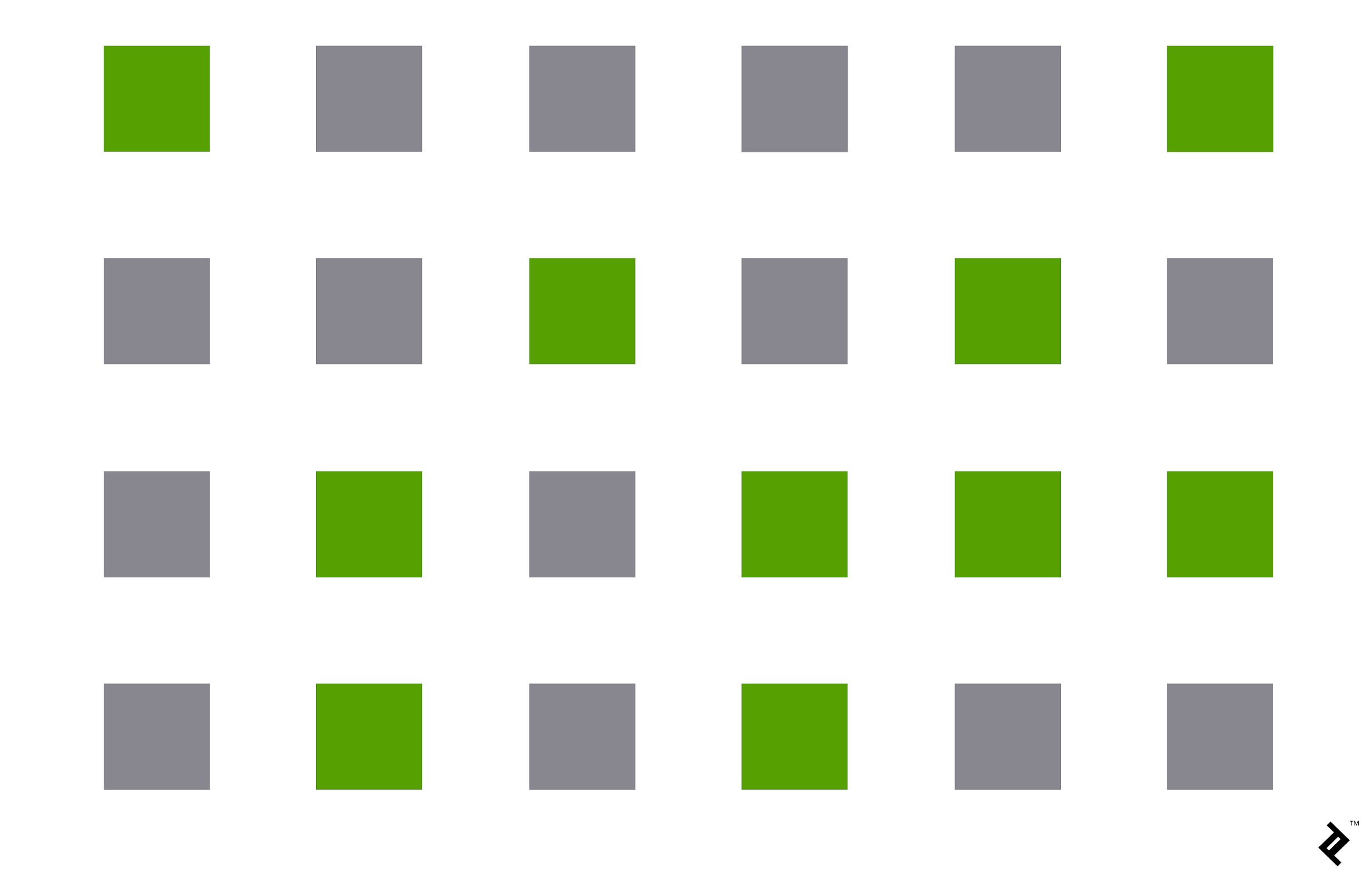
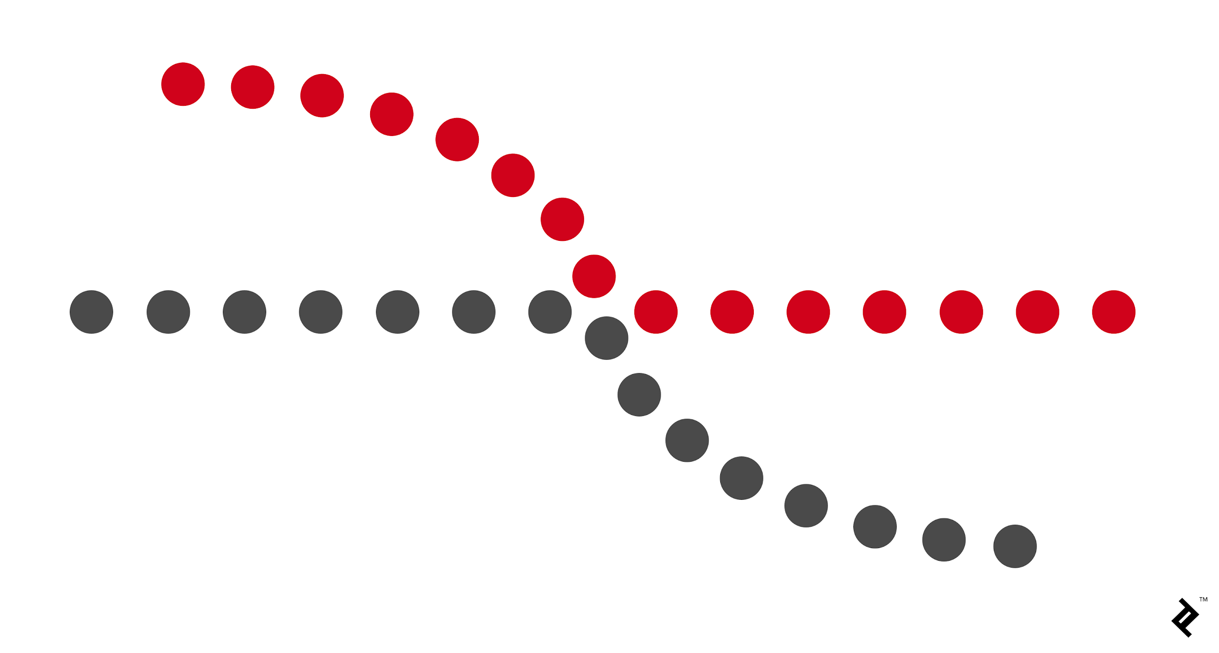
Proximity refers to how close elements are to one another. The strongest proximity relationship are those between overlapping subjects, but grouping objects into a single area can also give a strong proximity effect. And by putting space between elements, you can add separation even when their other characteristics are the same.
For example is this group of circles:

Closure is the principle where our brain ill fill in the missing parts of the design or image to create a whole picture. It allows our eye to follow something line to line.

Continuity
Continuity explain the natural of human eye that will follow the smoothest path when viewing lines, regardless of how the lines were actually drawn.
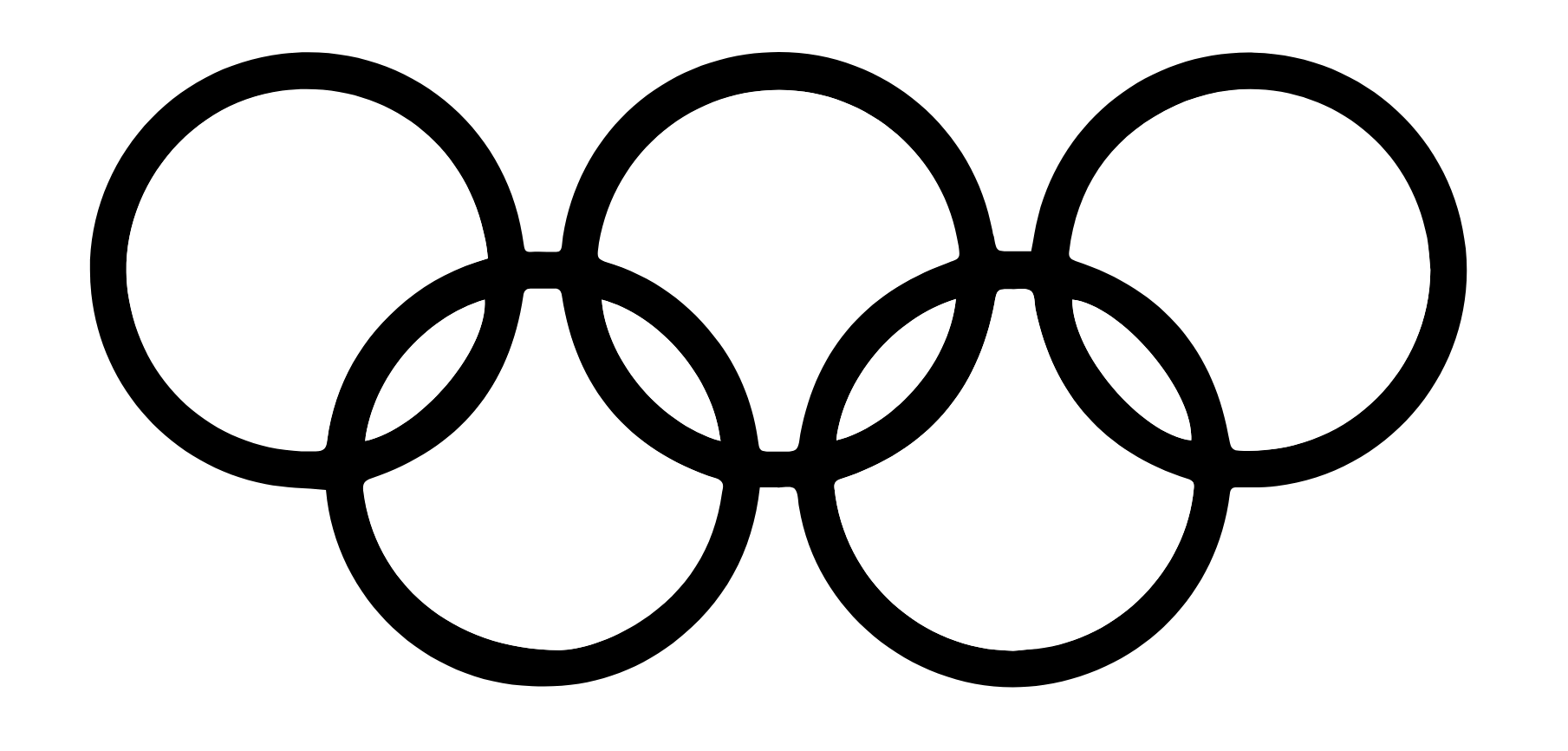
This law says that our brain will perceive ambiguous shapes in as simple a manner as possible. For example, a monochrome version of the Olympic logo is seen as a series of overlapping circles rather than a collection of curved lines.
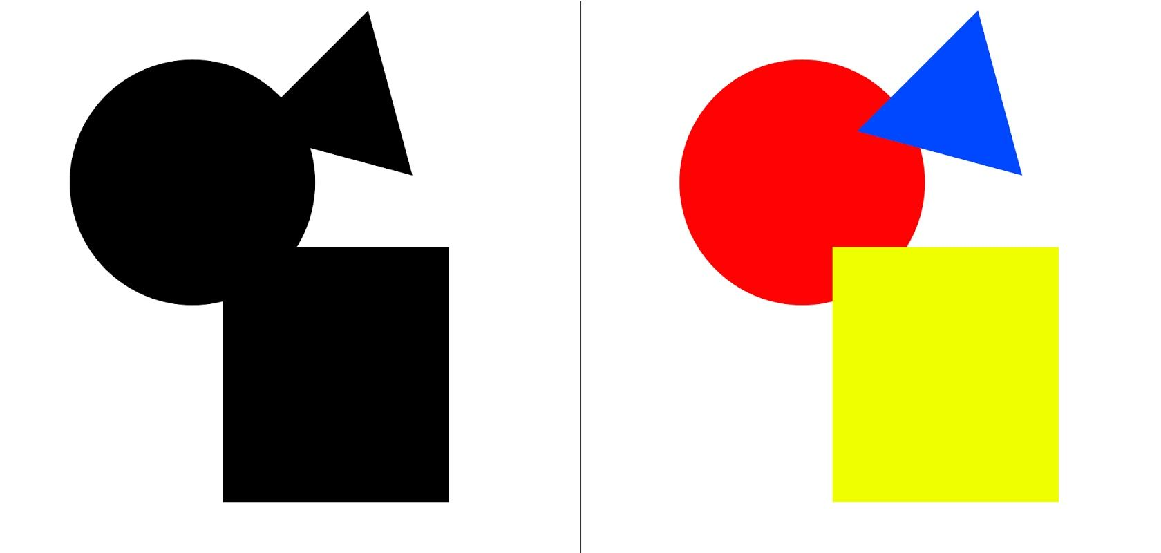
Your brain will interpret the image on the left as a rectangle, circle, and triangle, even when the outlines of each are incomplete because those are simpler shapes than the overall image.
1.4 Progress on Exercise
Instruction
When Mr. Charles told us to do 2 exercises that holds 1 of the design principle. I immediately thought of a poster using a unity design principle. And I knew I want to cooperate the design with hands. As I saw previous student made a design with hands raising up.
I searched on the internet and found these photos.

Figure 1.4.1 Hands pointing the same point

Figure 1.4.2 Hands holding tight forming a square
I don't want the hands to have these typical fist gestures. And I don't want the hands to be connected like the picture above. When I think of hand gestures, it brings me to the most universal children games that we all love and know. "Rock-paper-scissor!" Yes, this sparks the first sketch of this design.

Figure 1.4.3 Sketch of design 1
The next piece, I initially got inspired from one of my favorite Korean artist Lee-Hi with her music video titled "Saviour". Here are some of the screenshots of the music video that inspires me.

Figure 1.4.4 Scene 1 from MV

Figure 1.4.5 Scene 2 from MV

Figure 1.4.6 Scene 3 from MV

Figure 1.4.7 Scene 4 from MV
These scenes gave me the idea to make umbrellas, with using repetition and contrast. I sketched some designs and the final sketch, I come up with this design.

Figure 1.4.8 Sketch of design 2
Then I send this sketch to Mr. Charles. He thought the first design idea is good and can be develop more. The second design is quite overused. So I decided to use the idea of umbrella but jazz it up a little. A good note he add is contrast can be bring out not only using shape or color.
1.5 Exercise in Class
Mr. Charles told us to make some monogram. I thought that I could manipulate the figure-ground. Also using the one of the design principle, closure. The last one I thought maybe making the font fits the whole canvas/space it can create an interesting result.

Figure 1.5.1 Monograms
Jumplinks 🐉
References:
- https://www.toptal.com/designers/ui/gestalt-principles-of-design
- https://www.interaction-design.org/literature/topics/gestalt-principles
- https://design.tutsplus.com/articles/the-principles-of-design--cms-33962
- https://xd.adobe.com/ideas/process/ui-design/6-elements-design/
- https://99designs.com/blog/tips/principles-of-design/#:~:text=The%20principles%20of%20design%20are,has%20to%20have%20a%20purpose.
- https://times.taylors.edu.my/course/view.php?id=71169